
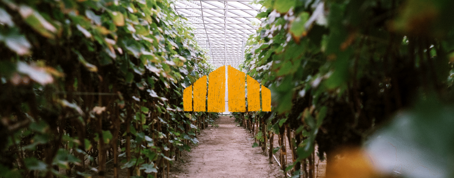
Greenhouse dreams are made of these
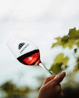
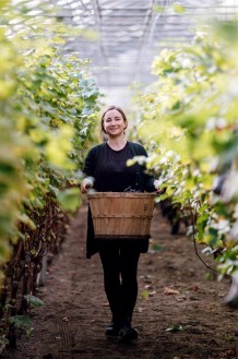
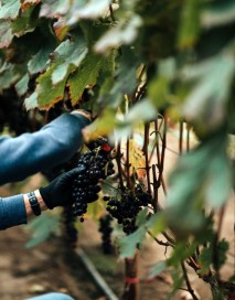
Somewhere above the 46th parallel, in the Laurentians, wine varieties like merlot, gamay, and pinot noir are being cultivated in a smart greenhouse. It's through a creative blend of dedication, perseverence, and patience that the father-daughter duo from the Zyromski family have succeeded in creating classic wines using grapes grown in Quebec. Our team was brought on to name and design the project, eventually dubbed Zyromski Wines.
Designed to pique curiosity
The label and design play a crucial role in helping us choose a bottle of wine. We needed to build an eye-catching visual identity that would help the brand stand out while respecting industry norms - and we needed to do so for two distinct types of wine.
There are countless wine brands, but only one with varieties grown in a Laurentian greenhouse.
The product's unique story became the starting point of our creative process. From there, we had to develop two different identities: one reminiscent of the more traditional codes of classic wines, and one with the refreshing perspective of wine blends.
Crafted to tell a story
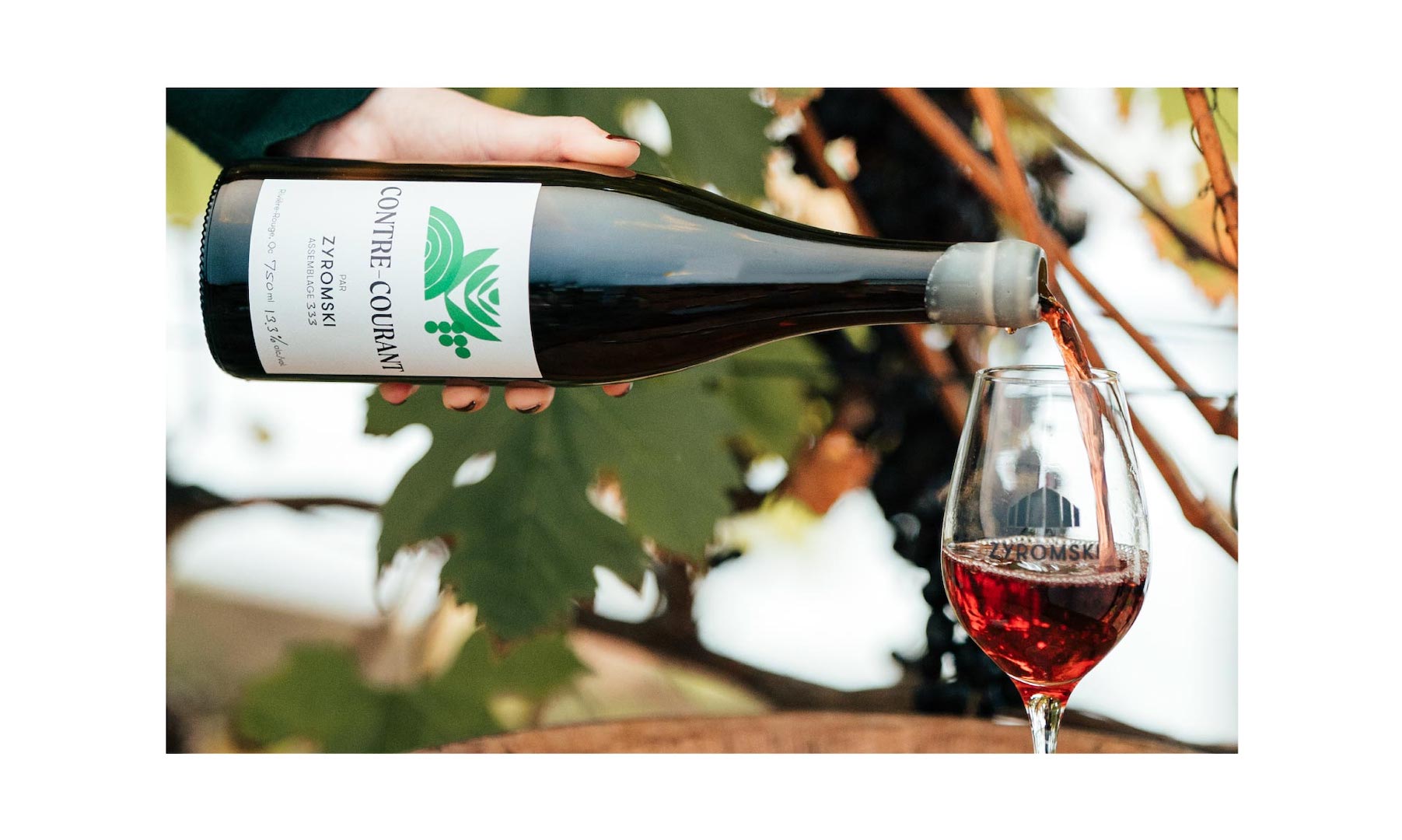
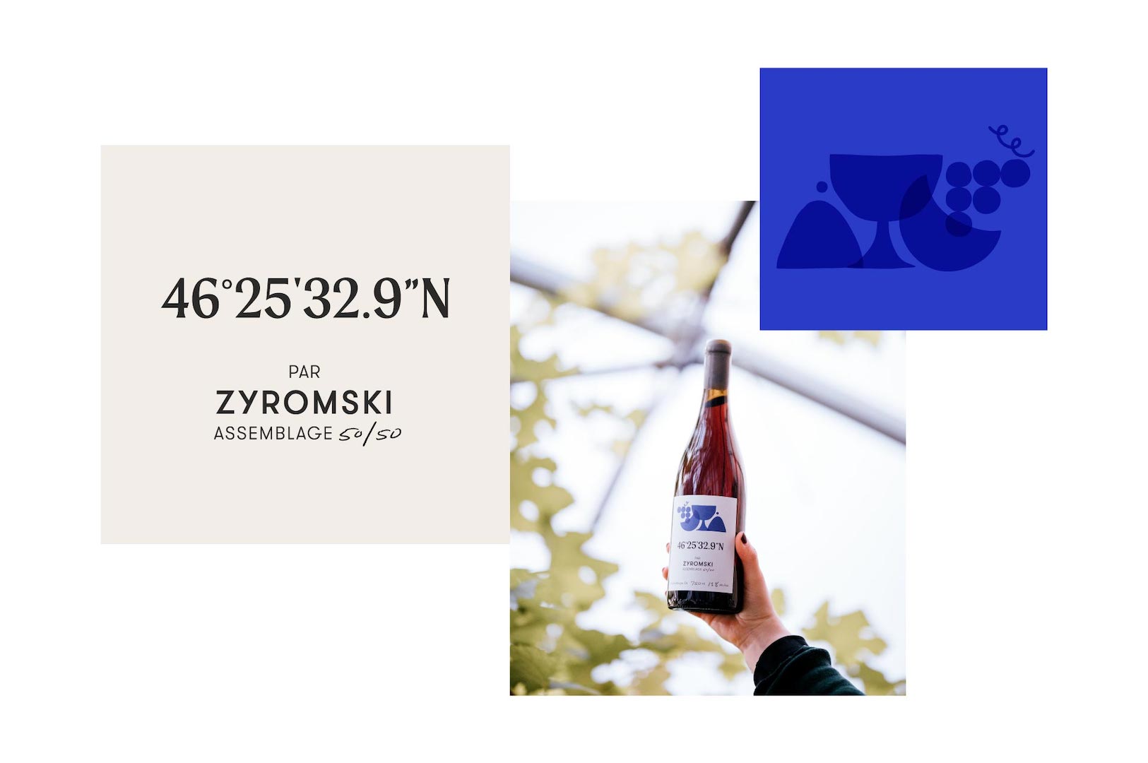
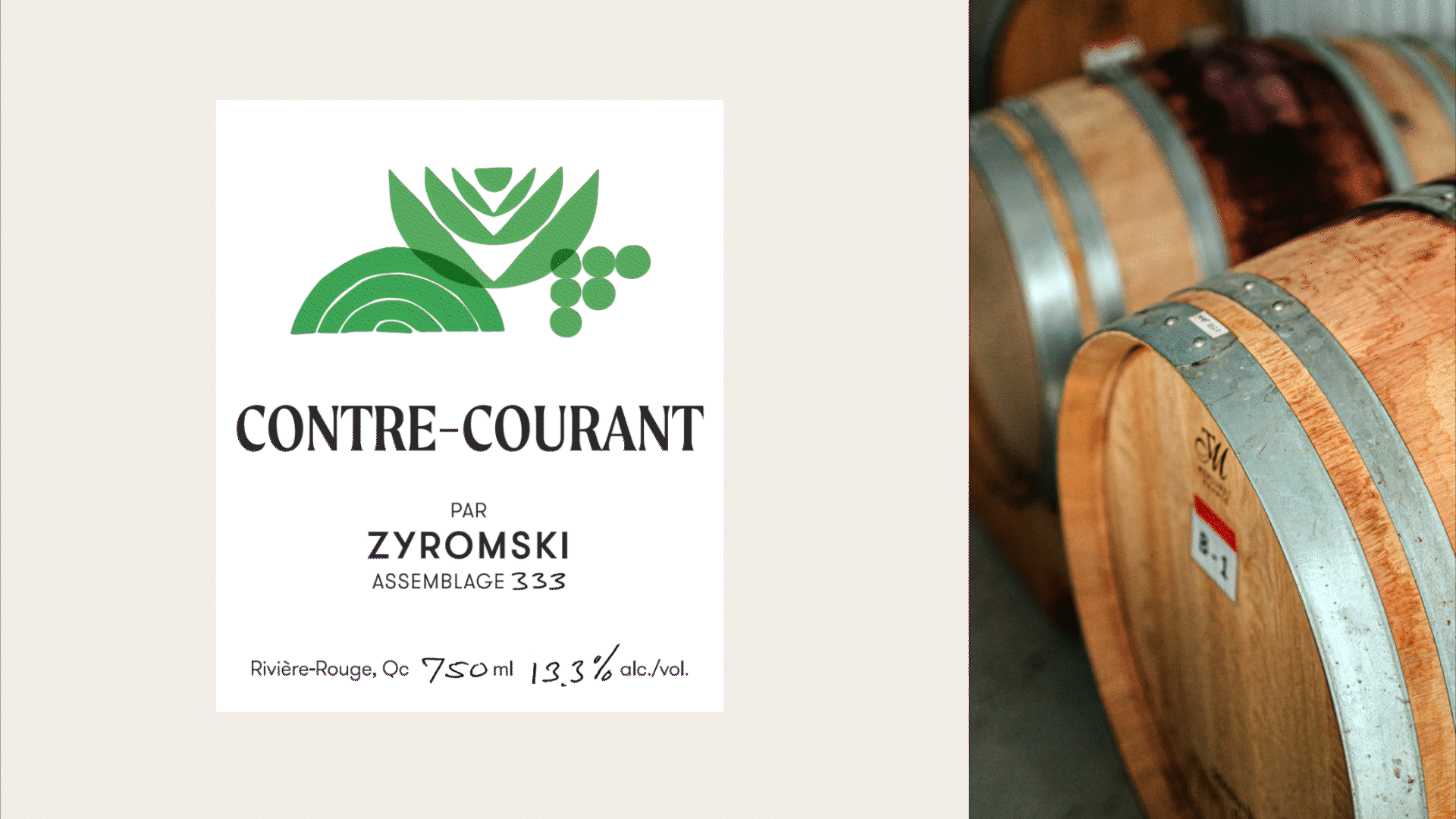
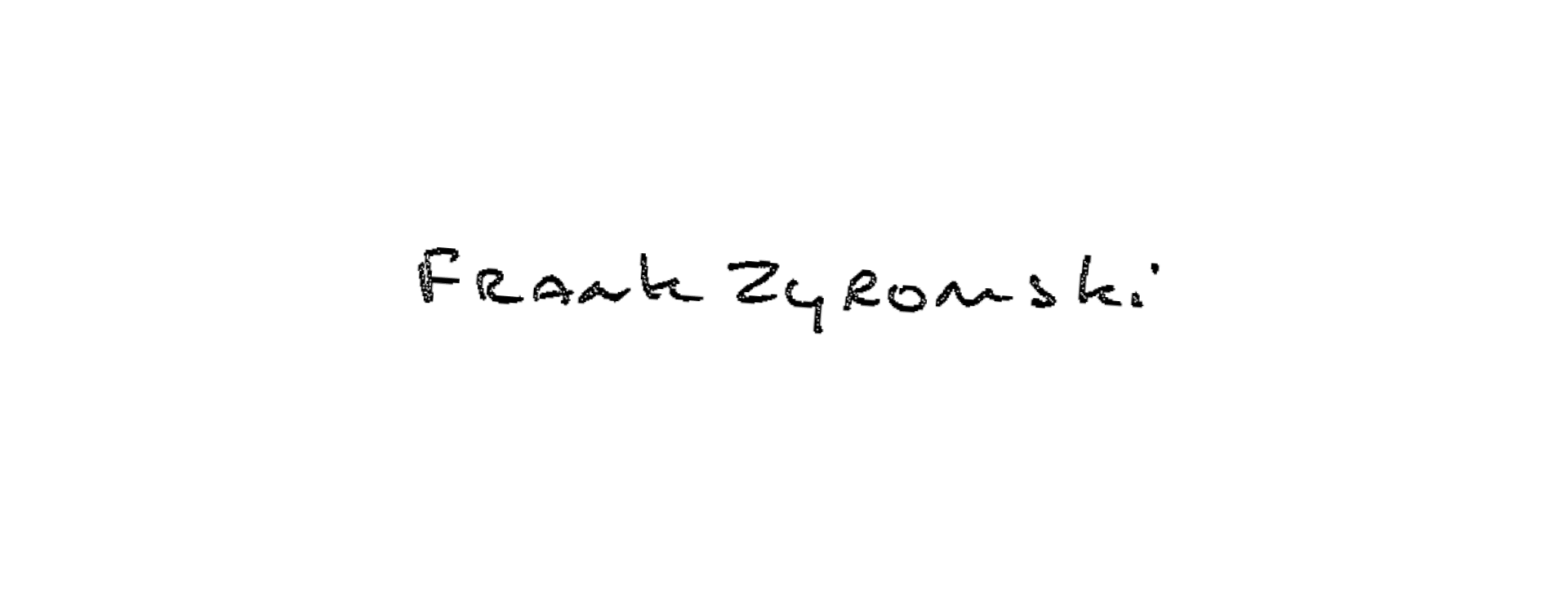
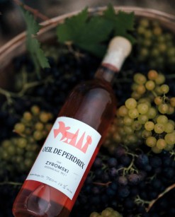
The brand's art direction was crafted to tell the unique story of the Zyromski family and its greenhouse-grown varieties. The straightforwardness of geometric shapes is combined with a human touch thanks to a brand symbol that represents the greenhouse. In a simple and minimalist way, the greenhouse stands proudly at the center of the labels for classic single-grape varieties and their names are handwritten by Frank Zyromski himself. The wine blends display a more joyful and colourful approach. By combining red and blue, which represent the region's Rivière Rouge ("red river") and its nordicity, we were able to highlight elements like grapes, snowflakes, rivers, and flowers. To top it all off, we illustrated each of these elements using a papercutting technique to match the brand's artisanal attention to detail.
"When a brand identity goes beyond aesthetics to tell a story, I think that's when we land on truly unique visuals. Every graphic element specific to the projet helps it stand out from others."
– Julie de la Rocq, Art Director
A first harvest already bearing fruit
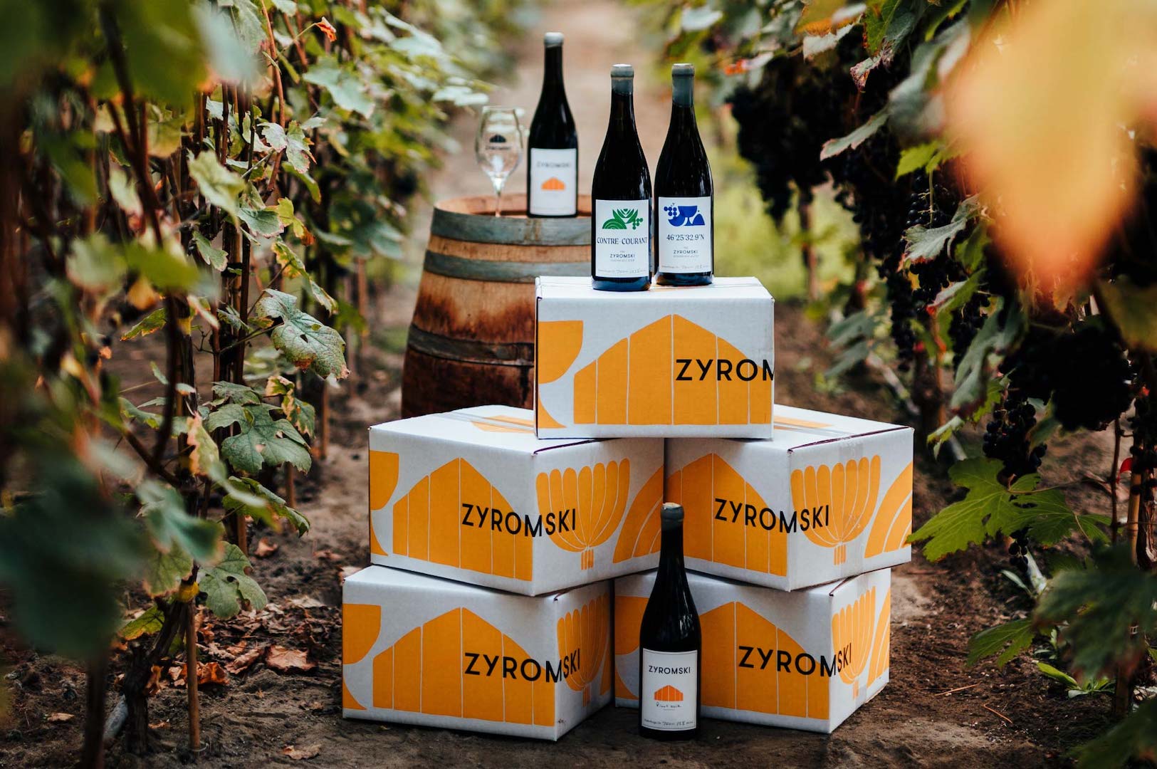
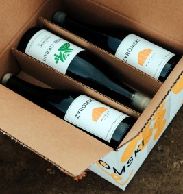
The products, sold in very limited quantities, were quickly sold out after their release. Word of mouth, an exceptional reception on social media, the uniqueness of the product, and the efforts put in by the Zyromski family all greatly contributed to the success of this first harvest and bottling. Only distributed in a handful of specialized boutiques in the greater metropolitan area, these bottles of Zyromski wines were enjoyed by a lucky few.
It might not show, but there's a decade of learning, investment, hard work, and extreme discipline behind these bottles. When we finally received our alcohol license from the SAQ, we immediately reached out to Republik for their opinion on our unique vines. While many were sceptical, Republik told us we were bold, entrepreneurial, future-driven, and completely wild, in the best sense. Working on a father-daughter brand with a boomer-millennial clash was a challenge they embraced from the get-go, and the result exceeded our expectations.
― Julie Zyromski, Winemaker
Collaborators on the project
― Patricia Brochu