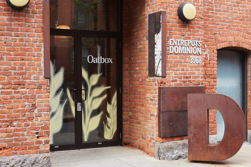
Oatbox
We’re all in on oats to stimulate sustainable agriculture
Opportunity
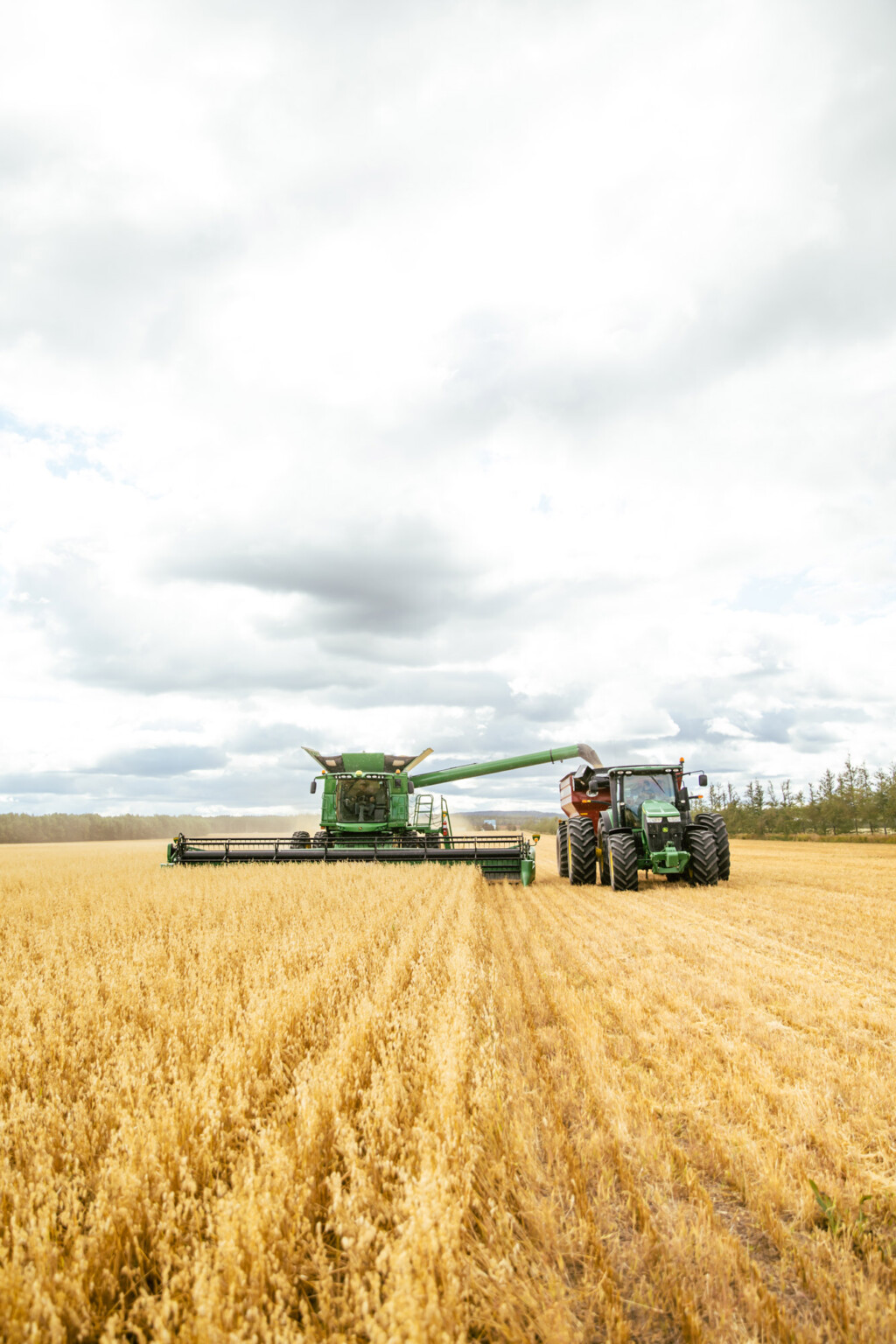
Oatbox has always believed in oats. Today, the brand is convinced that it has the potential to revolutionize sustainable agriculture by feeding more people with fewer resources. The Quebec-based company tasked our team with the redefinition of its brand purpose and business strategy in order to better align itself with its convictions. We needed to mark this repositioning – while major for the brand, perhaps subtle to its consumers – in a way that would flip the perspective on oats: from a humble breakfast cereal to a mighty seed of change.
Creation
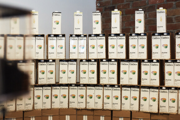
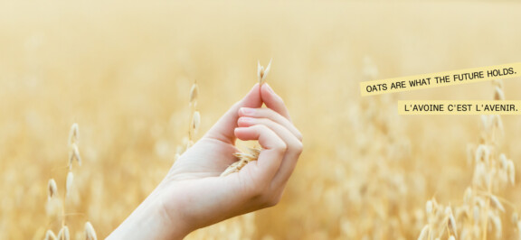
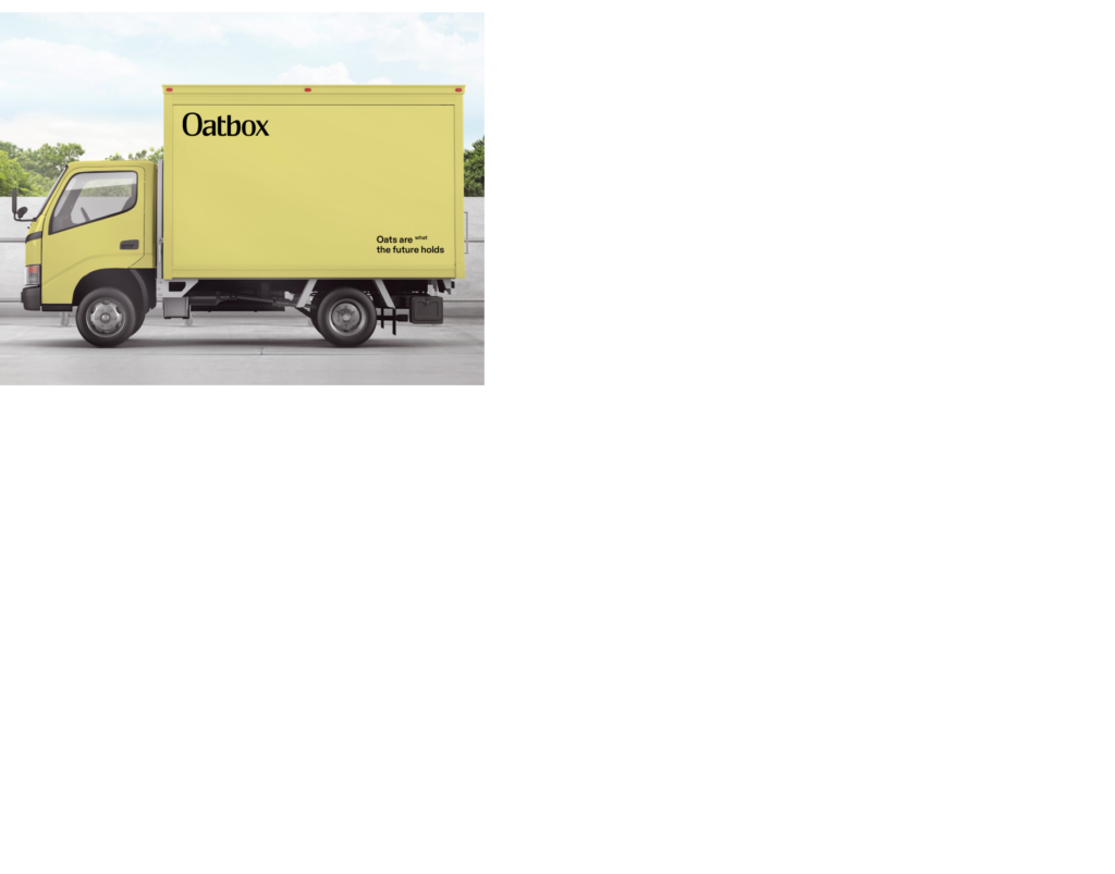
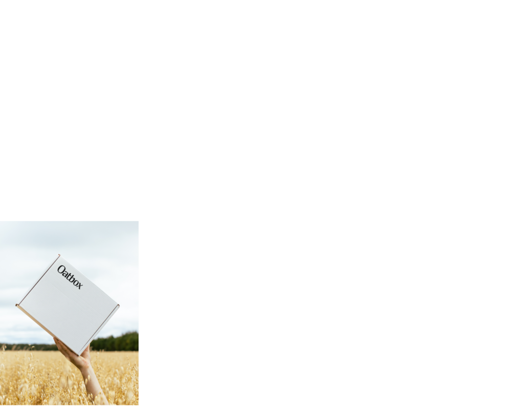
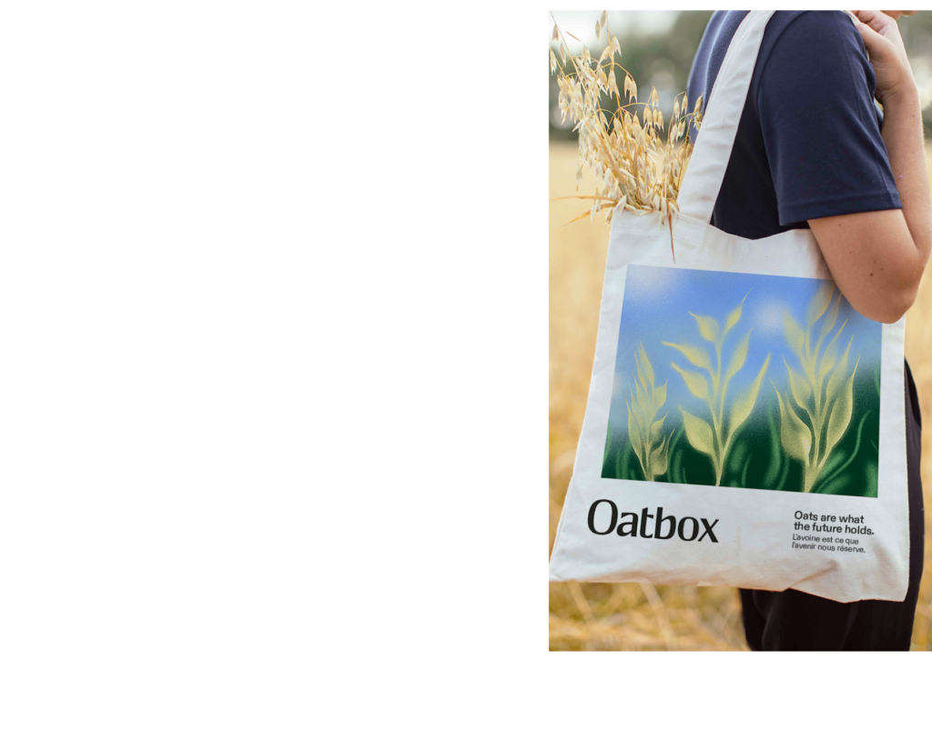
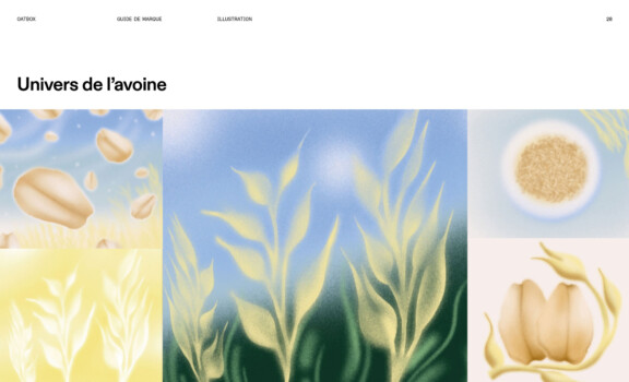
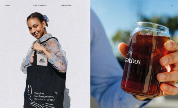
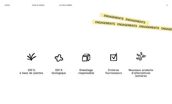
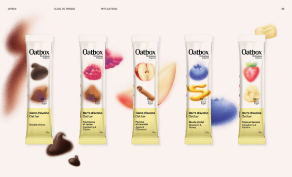
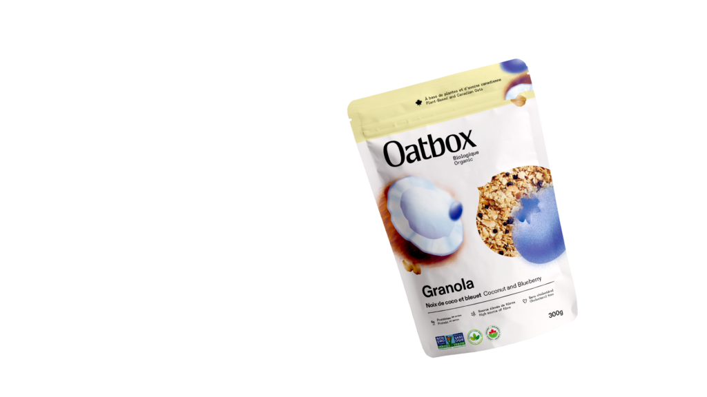
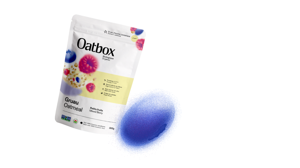
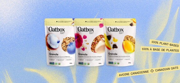
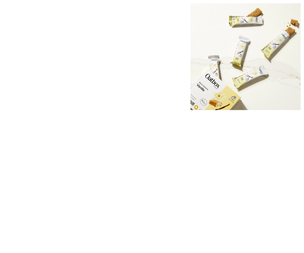
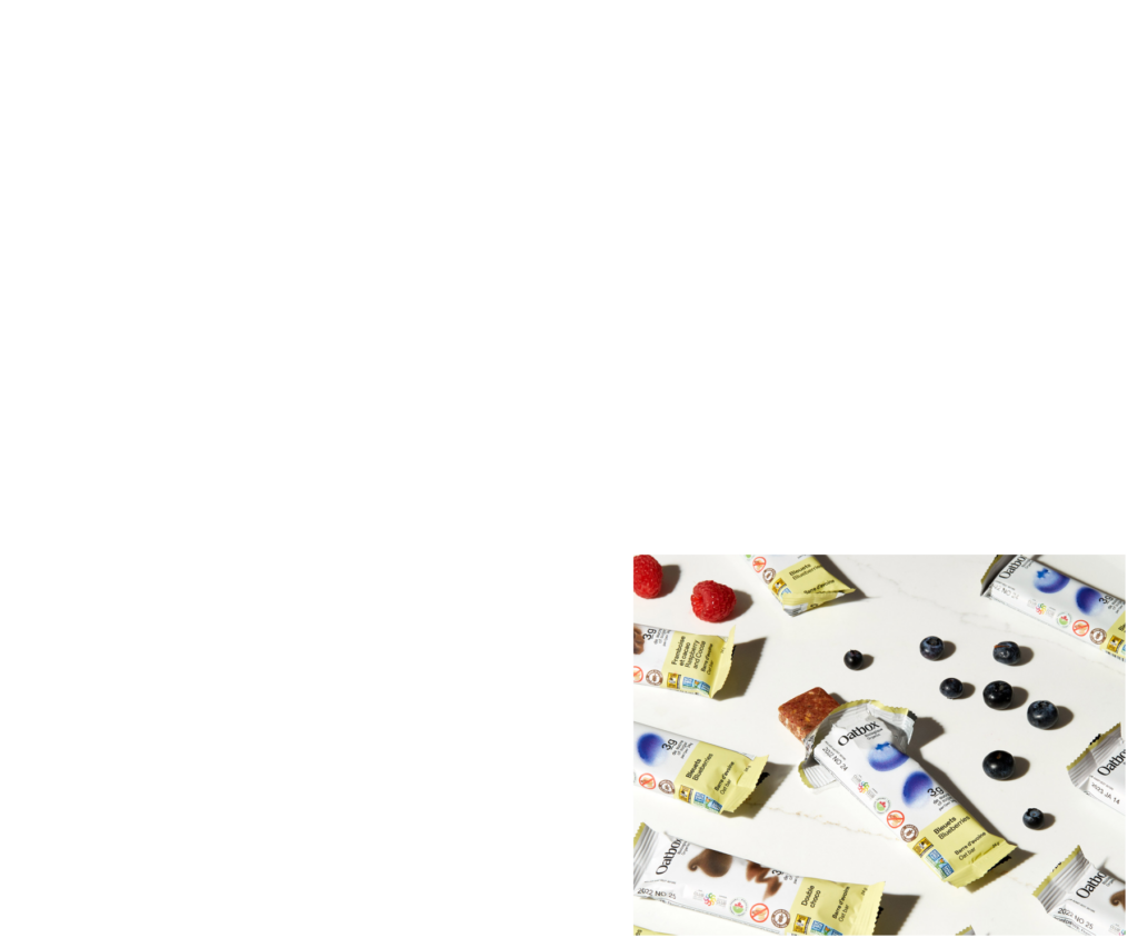
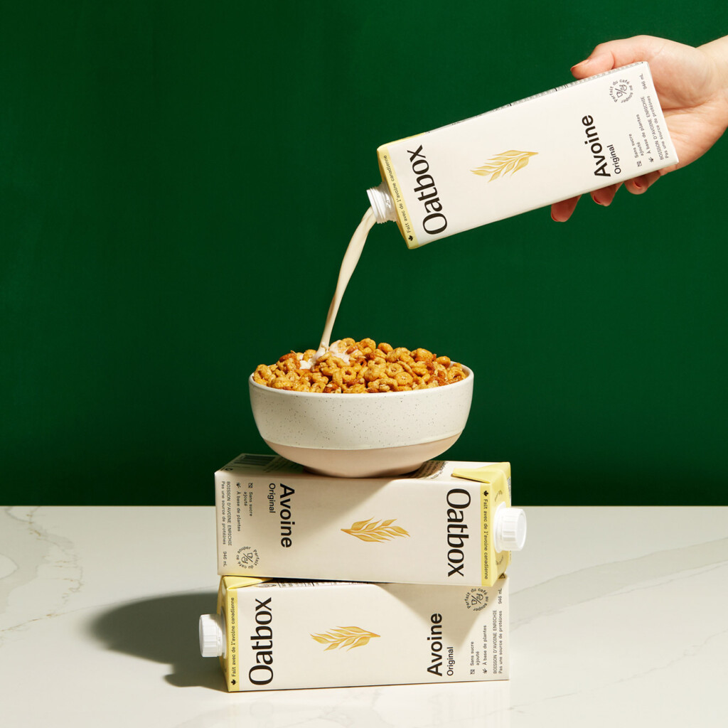
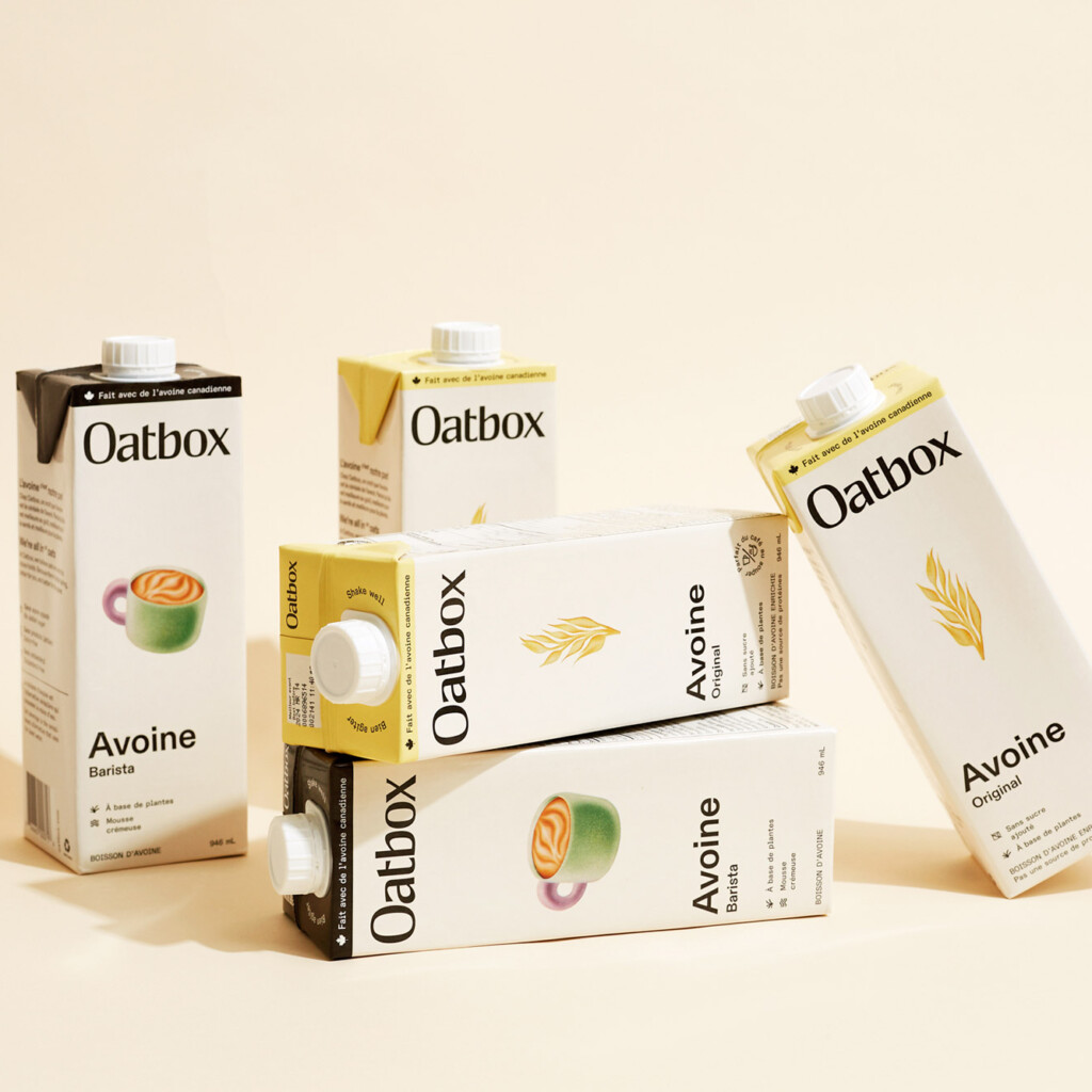
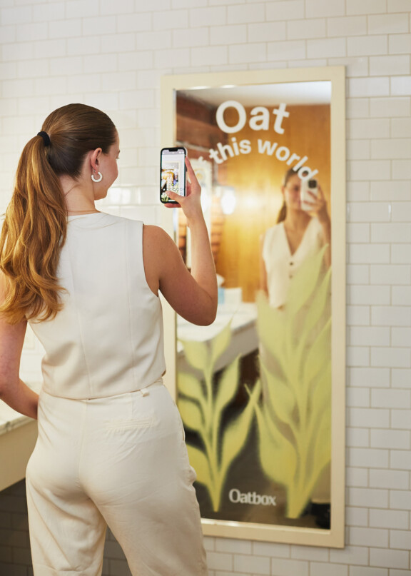
While some feel that oats are beige and boring, we believe that oats are what the future holds. Oatbox’s rebranding was the perfect opportunity to elevate the product, while maintaining the taste appeal that had always made Oatbox popular and highlighting newly responsible packaging, ingredients, and suppliers. The new brand platform – executed via packaging, a launch video, a website, social content, and a campaign – goes all in on oats.
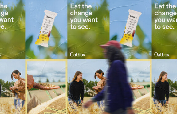
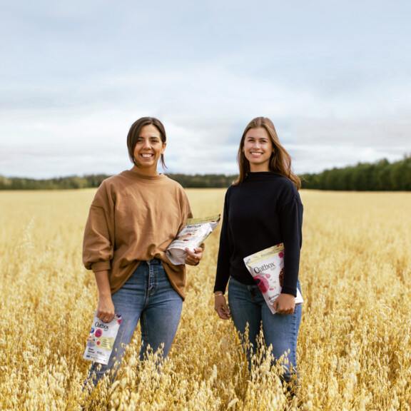
Le rebranding a constitué un tournant décisif pour Oatbox, nous positionnant comme une marque à la fois innovante et engagée dans ses valeurs environnementales. Bien plus qu’un simple rafraîchissement visuel, cette transformation a pleinement capturé l’essence de notre mission d’explorer le plein potentiel de l’avoine.

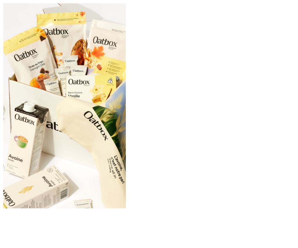
Innovate with a range of products

Product launch
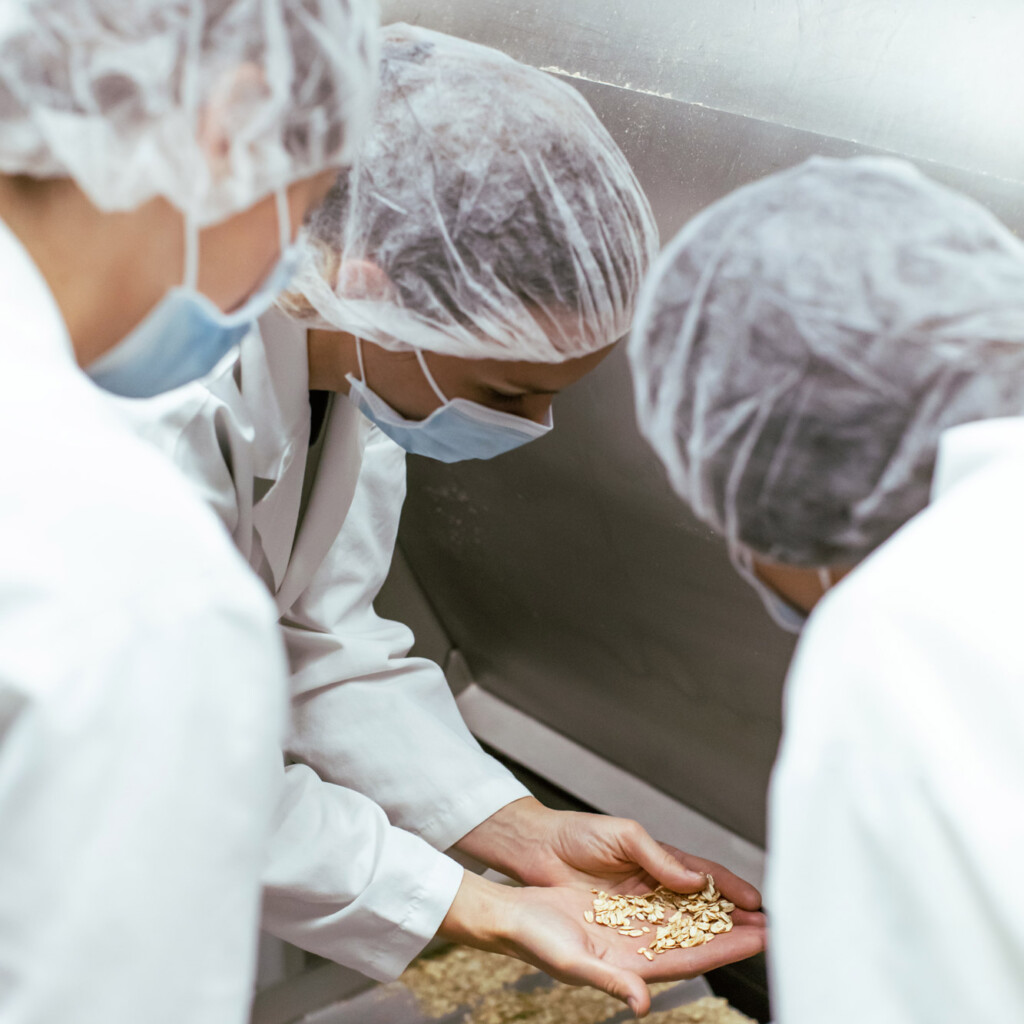
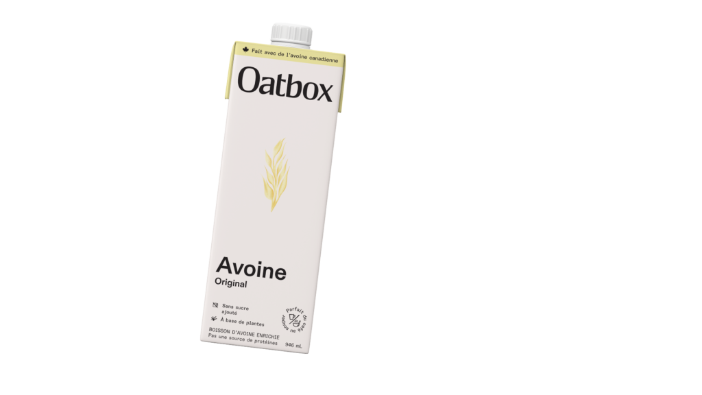
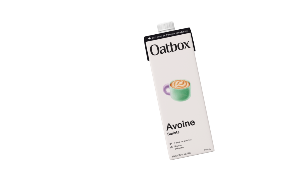
Product innovation & launch
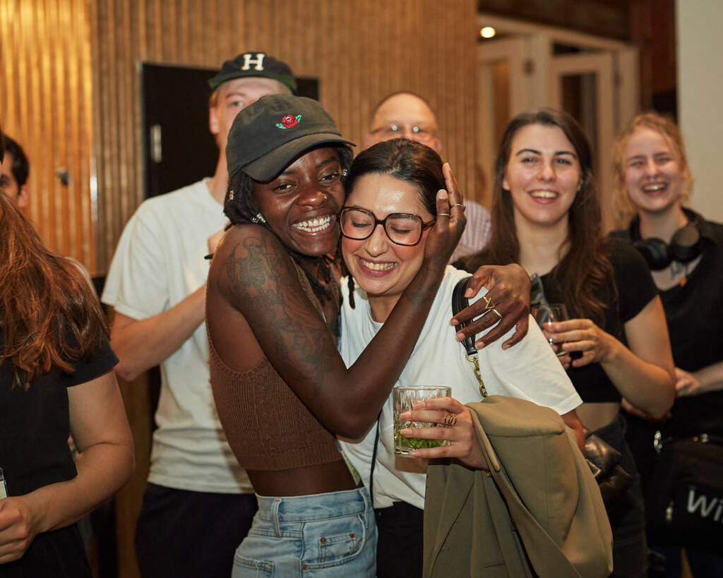
Seeking to expand its product range, Oatbox developed its own oat beverage: an original and a barista version created for perfecting latte art. For its launch, Oatbox commissioned Republik for the scenography, signage, informative displays, decoration, logistics, and guest experience for a latte art competition that would reflect its new brand image. From reusable or compostable cups to educational stations, we made sure to highlight the brand’s environmental vocation.
Impact
Before undergoing its transformation, Oatbox was a breakfast brand that relied on polished aesthetics to attract its clientele. Through Republik’s repositioning, it has evolved into an oat brand that leverages innovation to drive sustainable agriculture and food technology in Quebec. Oatbox’s impact-driven rebranding is a leading example that was showcased at the 2023 Infopresse Summit on impactful marketing.