
April 13th, 2023 ― Marketing
HR Marketing: Purposeful companies attract, retain, and mobilize employees

Learning how to gain the most conversions possible for your site can seem like an uphill battle. You can try different call to action (CTA) buttons in different colors, adjust placement on the page and pay attention to every little aspect of your site, but one area you might not have considered is your footer.
Footers are often an afterthought when creating a website. After all, they are well below the fold, so most site visitors may not make it that far down on your page. But, the truth is, footers can help increase your conversions more than you might think.
Pull in outside input to make sure your footer works the way it should, and site visitors are getting the main point you want them to get from your footer. There are five ways that footers can play an important role in the conversion process.
The best footers are fairly simple and not cluttered with endless information. Your site visitor has made it to the end of your page and may be information overload. By keeping the footer simple, you guide the visitor through the conversion process.
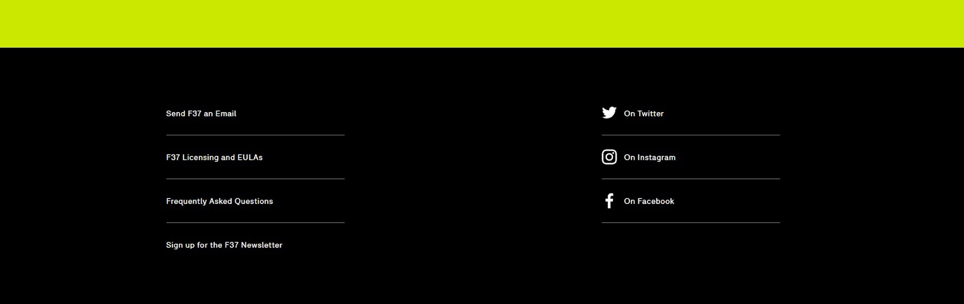
Probably one of the best simple footer designs belongs to F37. The entire page is fairly uncluttered to start with. Scroll down to the footer, and you'll see easy navigation items on the left and social media links on the right. That's it. It makes it clear what the site wants visitors to do — engage with the company and connect on social media.
There are more people using mobile devices to connect to the Internet. About 77% of Americans now own a smartphone, and many of them are using those phones to get online. It is more important today than ever before that your site be fully responsive and that includes the way the footer looks on a smaller screen.
Not only do people use smaller screens to get online, but Google states about 90% of people who own more than one device will sometimes switch between multiple sized screens when trying to accomplish something online.
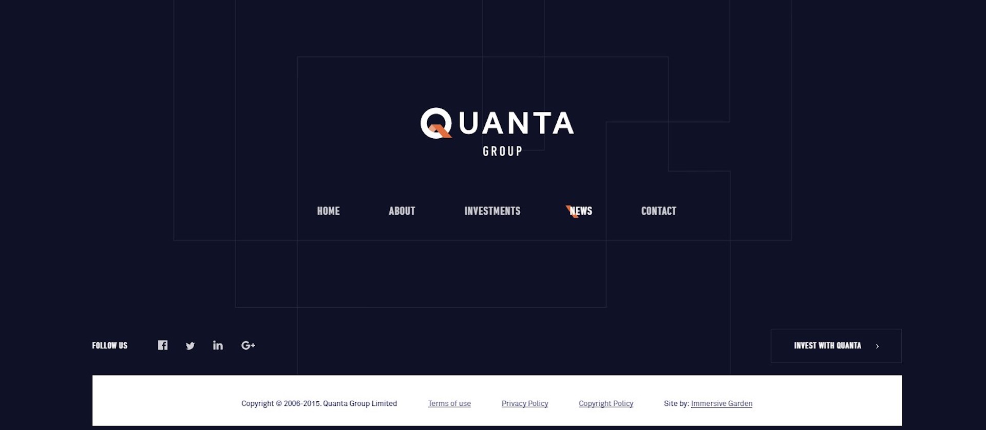

Quanta Groups’s footer has a clean design that also works well on smaller screens. This is a vital component to making conversions with tablet and mobile users.
Email still works as a valuable marketing tool. Sending emails makes smart business sense when you realize you're about six times likelier to get a click-through from email marketing than from a Twitter campaign.
The footer is a good place to add a signup form for your mailing list. There are a number of ways you can do this, such as offering a free book if the user signs up.
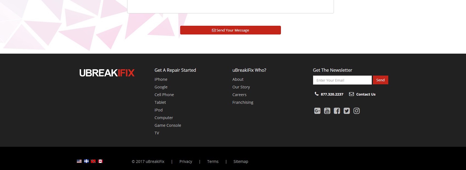
One example of an effective footer with a newsletter signup feature can be found at uBreakiFix with their simple "Get the Newsletter" call to action combined with a simple signup form. This is effective because site visitors who have scrolled to this point are already interested in what the business offers. Now, they can stay updated by simply typing in their email and hitting a button.
It is sort of understood in the online world that contact information will likely be located at the bottom of a website in the footer. Your online visitors will expect to see that information there. This provides a level of trust for customers so they feel more comfortable making a purchase from your website and thus convert into paying customers.
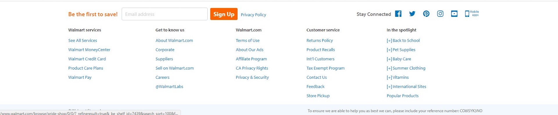
Super-retailer Walmart has a huge online store. While some people already trust Walmart because they are an established name in brick and mortar retail, others may not trust the online ordering process. Fortunately, Walmart puts an entire customer service section in their footer to prove they are trustworthy. It includes info on their returns policy and a Contact Us link.
Footers naturally lend themselves to navigation. However, there is no law that says you must add every single link on your site in the footer. You can certainly narrow down the choices to funnel your site visitors a certain way. If you limit the number of things to click on, the odds of them going where you want them to are increased.
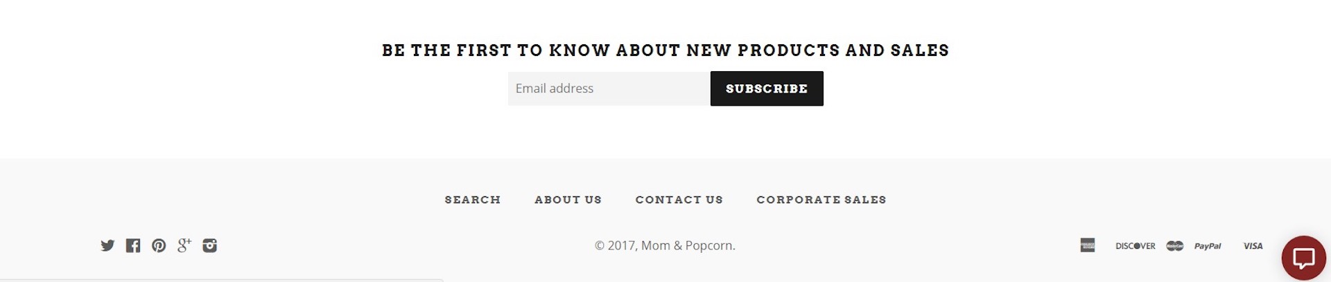
One example of a site that does this well is Mom and Popcorn. The links in the footer are very simple: Search, About Us, Contact Us and Corporate Sales. Above those links is a simple signup form for updates on new products and sales. This is a very effective use of the footer area to funnel customers to different locations on the site.
The footer is yet another vital element that makes an excellent website. All the parts should come together to create the perfect experience for your site visitor. Remember that if someone makes it to the end of your page, they have already engaged with your content. This is a great time for your call to action and to entice them into signing up for something.
Each element on a page contributes to the entire conversion process. The footer adds yet another layer that can convert browsers into customers.