February 28th, 2024 ― Social Capital
Purplewashing: what is it and how to avoid it?
How to create social capital is a series of articles that aims to make social and environmental impact in business more accessible. Through their texts, Republik specialists, a social impact creative agency, address topics pertaining to impact, content and branding.
We tend to think that web accessibility is a roadblock for very few people. Why should we change our ways for only a small percentage of the population? The problem is that web accessibility affects more people than we might think.
In Quebec, nearly one in three people lives with a disability, yet less than 20% of Quebec websites pass the test when it comes to accessibility.12
Surfing the Web and browsing social networks can be quite complex for those with visual limitations—yes—but also for those with hearing, motor and cognitive limitations.
Web accessibility is also an issue for other groups, such as people with low reading levels. In Quebec, 49% of people between the ages of 16 and 65 have reading difficulties.3 And let’s not forget our province’s aging population and those who may not master a website’s language.
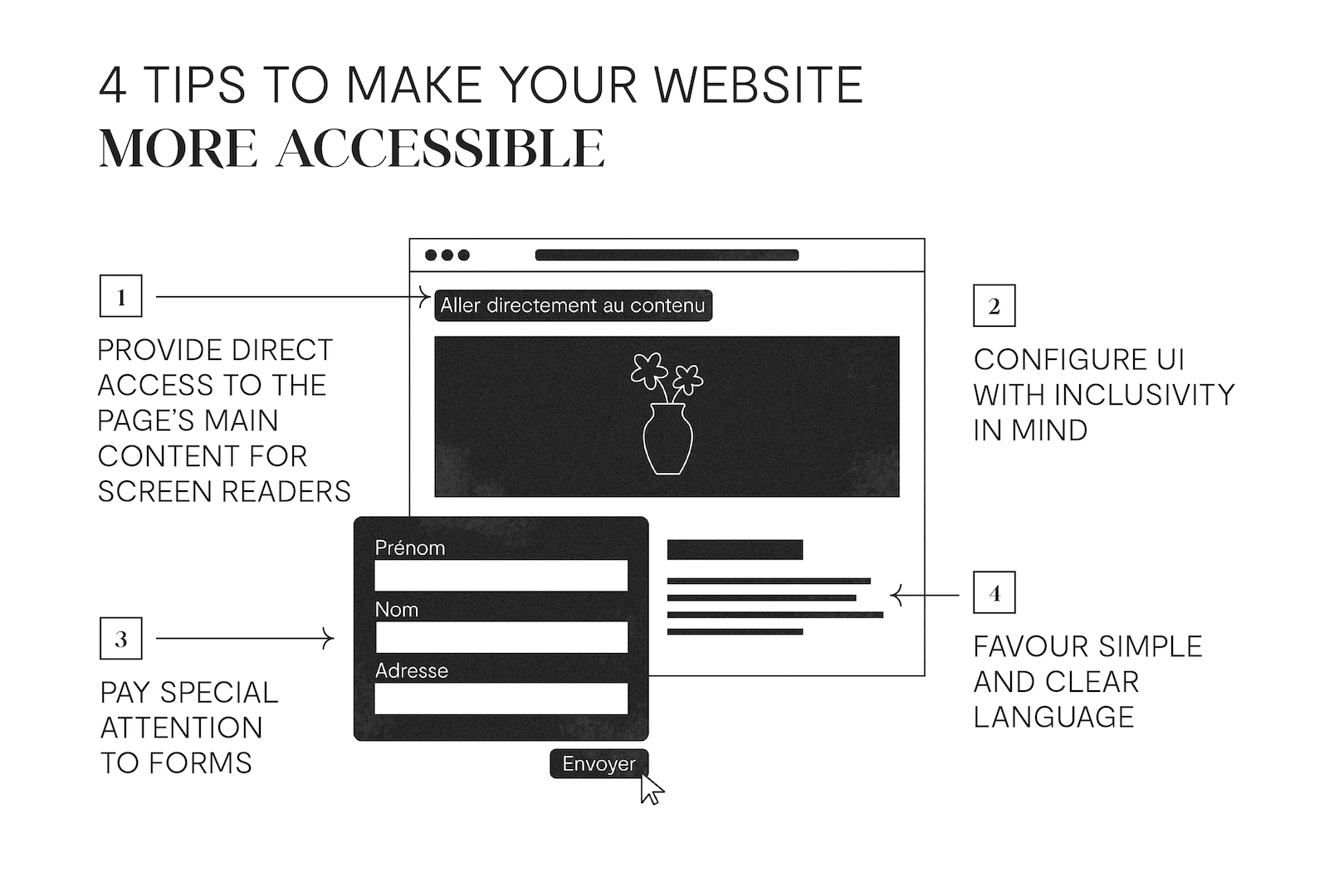
Imagine having to scroll through all the items in a navigation menu one by one before being able to access a web page’s main content. This is what people who use a screen reader or other accommodative tools for motor limitations are faced with.
To make their lives easier, you can configure a clickable button visible to accommodative tools at the top of your page to send them directly to its main content. Don’t forget to identify the page’s various elements, such as titles or subtitles, with the right headings (H1, H2, H3, image, etc.) to facilitate reading!
Brands, and creative agencies, tend to want to knock people’s socks off with websites that push the boundaries of originality. Whether it’s a funky colour scheme or all-over-the-place navigation, a website’s interface can quickly become impractical for many people.
The idea here isn’t to stick to a web page similar to those created in the Internet’s early days, but rather to keep in mind that the people who will consult your web pages might have disabilities that differ from your reality.
This might mean leaving out visually complex graphics that will be difficult for accommodative tools to read. Or avoiding gray or red text and low colour contrasts that will be less noticeable to people who are aging, visually impaired or are affected by astigmatism.
Forms are frequently used to make contact, get a quote or an appointment and complete a transaction. To maintain web accessibility, first make sure that the tabulation order is logical. For example, in a two-column form, you should not have to fill in your street address between your first and last name.
Make sure to identify empty fields in the page’s source code. Accommodative tools will use this information to communicate what is expected at that point in the form. If the field does not have a corresponding label (e.g., name), the user will be unable to know what to fill in.
Time-limited forms are also a no-no, especially if there is an automatic logout after the allotted time. At the very least, offer the possibility to extend the time limit or to deactivate it. Finally, the famous CAPTCHAs that give bots—and humans—a hard time should be avoided.
As aforementioned, nearly half of Quebec’s population between the ages of 16 and 65 has reading difficulties. To reach as many people as possible with your content, swap jargon and technical language with a more accessible vocabulary. If you must use abbreviations, such as for organizations and certifications, consider writing their full names first.
Keep your sentences and paragraphs short. Consider breaking up your text with headings, subheadings and lists. When writing, remember that clarity is more important than creativity. For this reason, think twice before using a ton of wordplay or colloquialisms.
Because a picture is worth a thousand words, add visual content that might aid in comprehension (while also adding alternative text for people with visual limitations!)
Note that frills, such as animated content or videos that play on a loop, can be detrimental to people who have difficulty concentrating and understanding text.
First of all, it’s a good idea to make your design team aware of accessibility roadblocks so that they may adapt their creative thinking beforehand and not just when it’s time to design posts for social networks.
Special attention should be paid to visuals with text. Similarly to a web page, make sure to avoid low colour contrasts, and font sizes that are too small or too thin.
Keep in mind: designers work on large screens when they create visuals, but the finished product will probably be seen on a phone screen.
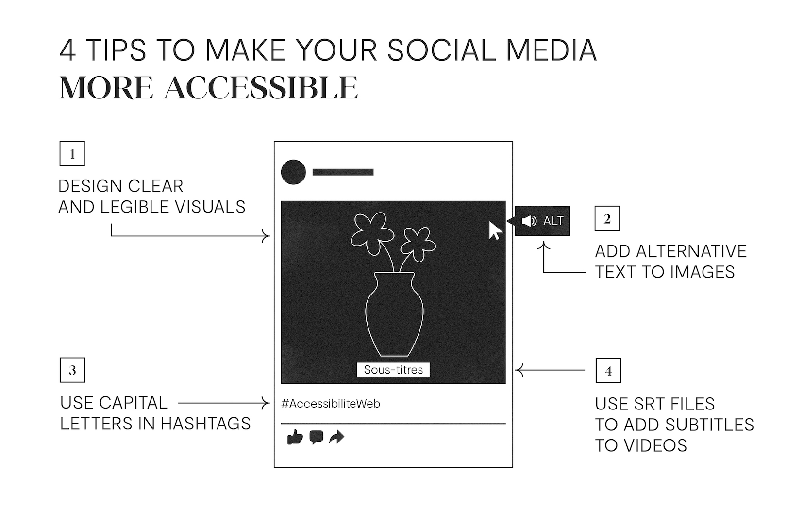
Whether on the Internet or on social networks, adding alt text (ALT) is essential for people who use screen readers. The alt text should describe both the visual and informational elements in the image.
To help you develop your skills, read your alt text out loud to another person before showing them the visual. Does the visual match the mental image they had of it? If so, well done! If not, make the necessary corrections to ensure a better understanding.
It may not seem like a big deal, but adding a capital letter at the beginning of each word in a hashtag is very important. This simple detail allows screen readers to read your hashtags fluidly—namely, on Instagram—and makes comprehension easier for everyone!
Simply put, an SRT file is a text file that stores a video’s subtitles in a given language and is uploaded separately from the latter when the content is shared on social media.
Unlike subtitles embedded in a video, SRT files allow you to make subtitles from a given publication available in multiple languages. In addition, subtitles generated by SRT files are often more legible.
Subtitles are essential when sharing a video on social media not only for people with hearing limitations, but also for a majority of people who browse their news feed without sound.
According to a 2019 U.S. study by Verizon Media and Publicis Media, more than 69% of respondents said they watch muted videos in public spaces.4 Eighty percent were more likely to watch a video in its entirety if subtitles were available.
The web, like many things in this world, was not designed for people with disabilities, even though they represent a significant proportion of the population.
Companies that design websites and social media posts have the opportunity to be part of the solution by implementing a few best practices, which are often very simple to carry out, to make the Internet more accessible and inclusive.